
at Real Fun, Wow!
Designing For:
Art and home decor customers discovering and purchasing original artwork and merchandise from artist Daren Thomas Magee.
Problem:
Customers were motivated to purchase, but the website's navigation, product organization, and lack of framing visibility created friction, driving cart abandonment and reducing conversions.
Impact:
36% increase in items added to cart, 27% increase in sales.
User Research
Navigation redesign
Category Optimization
Visual Browsing
Information architecture


Business Goals
As the vision for Real Fun, Wow! grew beyond its initial start on social media, it became apparent that the brand’s website needed a redesign to better serve the growing number of e-commerce shoppers. After discussion with Daren, we articulated three goals for the redesign:

Improve navigation functionality
Make it easier for customers to find products of interest
Create more reliable sales funnels
Research & Methodology
Methods:
Heuristic review of current navigation and product discovery flows
User survey with 600+ respondents
Competitive analysis of similar DTC e-commerce brands
Insights
Design Implications
01: Untangling the User Journey
The first significant change was the navigation menu. Upon arriving at the site, users lacked clear direction due to poorly structured menu options.
The confusing information architecture discouraged thoughtful browsing and created unnecessary cognitive load, making it difficult for users to find what they were looking for.
Huh?


Poor visual hierarchy - all text appears at the same weight and size.
Lack of organization - no clear grouping of related items.
Minimal visual separation - different product categories blend together.
Low contrast - harder to scan quickly.
Flat appearance - lacks engagement.
After:
I restructured the header menu so users could quickly find the types of products they are interested in. This also eliminated the need to view all of the categories at once, which was a leading contributor of confusion when browsing the menu. The results provide:
Strong visual hierarchy - clear primary navigation items.
Better contrast - white text on dark green background.
Organized dropdown structure - groups related items logically.
Engaging visual design - draws attention.
Clear navigation flow - from broad categories to specific items.


I also added the submenu selections as image hyperlinks at the top of each collection page. This encourages quicker decision-making for users, reducing the time needed to find relevant products.
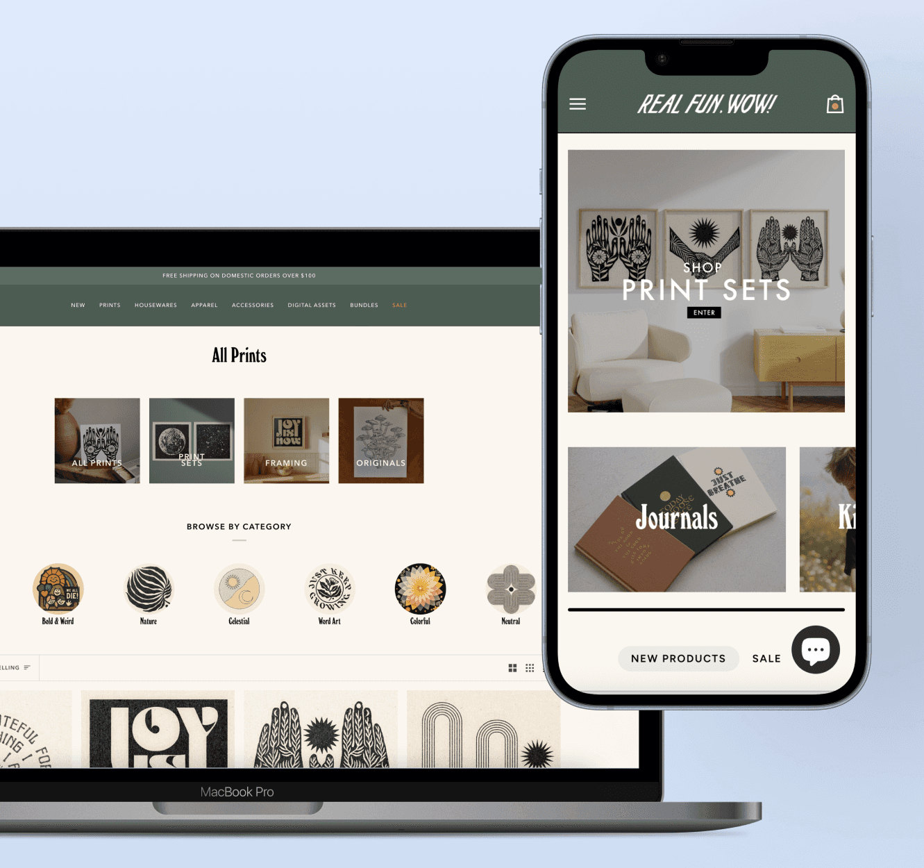
With 500+ prints available and no intuitive categorization or filtering, users faced decision paralysis. Many opted out of completing a purchase simply because they couldn't choose one from the long, unsorted list.

*Previously, all 500+ prints were shown in a single undifferentiated listing with no way to narrow by style, subject, or format. This is a visual re-creation intended to represent the way it affected users*


After collaborating to reduce the total print inventory by over 30%, I organized the remaining pieces into intuitive, browsable categories with filtering capabilities that streamlined the search experience.
In addition to option to browse via the customized browsing icons, I included the option to sort the prints using more traditional e-commerce filtering methods. This allows users to filter results that match multiple category descriptions and find products that fall into multiple categories.

03: The Missing Link
Some users were less motivated to purchase prints without a clear solution for framing. While budget-friendly framing options were already available on other pages of the website, many users expressed the hope of finding framing options when purchasing prints. It became clear that the available framing options were not commonly noticed via typical user traffic.
Before
The user finds a print that suits their interests
User asks, "I wonder if they offer any framing options?"
User navigates away from the print
User starts new search for framing solution
User returns to print selection or loses interest
User may or may not complete purchase
After
The user finds a print that suits their interests
User sees framing options listed on the product page
User adds both frame and print to cart
I designed an additional section on product pages to display framing options for customers who wanted a quick framing solution. This addition benefits all stakeholders by addressing a key friction point in the purchase process:
For Customers: This feature eliminates purchase uncertainty by providing immediate framing solutions at the point of decision. Customers enjoy convenient bundling rather than having to separately find framing options elsewhere on the site.
For the Business: Strategic placement increases average order value through effective upselling while reducing cart abandonment by addressing framing concerns upfront. This directly improves conversion rates by making the complete solution obvious.


Iterations & Tradeoffs
Designing for Real Fun, Wow! required balancing ideal solutions with real-world constraints, such as existing infrastructure, brand direction, and customer demographics. Here are some alternative approaches that were explored, and why I ultimately chose the final direction for navigation, product discovery, and framing visibility.
Huh?
Impact
36% Increase in Items Added to Cart
Design improvements increased customer purchase selections, boosting key sales metrics.
Faster Product Discovery
Dramatically reduced the steps required for customers to find relevant products.
Increased Product Sales by 27%
Enhanced engagement and reduced barriers drove significant revenue growth.
Results & Reflection


Results:
This redesign process was impactful and highly rewarding. New orders include a wider range of unique prints, user feedback has improved, and the customers are able to locate the products they’re looking for more easily.
What I'd Do Differently:
Conduct usability testing earlier (with 5–7 users) to validate the navigation structure before high-fidelity design.
Implement A/B testing on filter labels and category names (would data-drive the final IA rather than guessing).
Establish a post-launch review cycle to gather user feedback on filtering efficacy and iterate.
Future Considerations:
Merchandising Strategy - Real Fun, Wow! plans to bring more focus to merchandising in an attempt to reduce the expanding nature of product categorization. This will help reduce the occasionally burdening impression of the online shopping experience.
Mobile Enhancement - I hope to implement a mobile-friendly version of the print filtering categories. While the categories are still available on mobile interfaces through traditional filtering methods, the iconographic representation of the categories is only reflected on the desktop version.
Back to Top